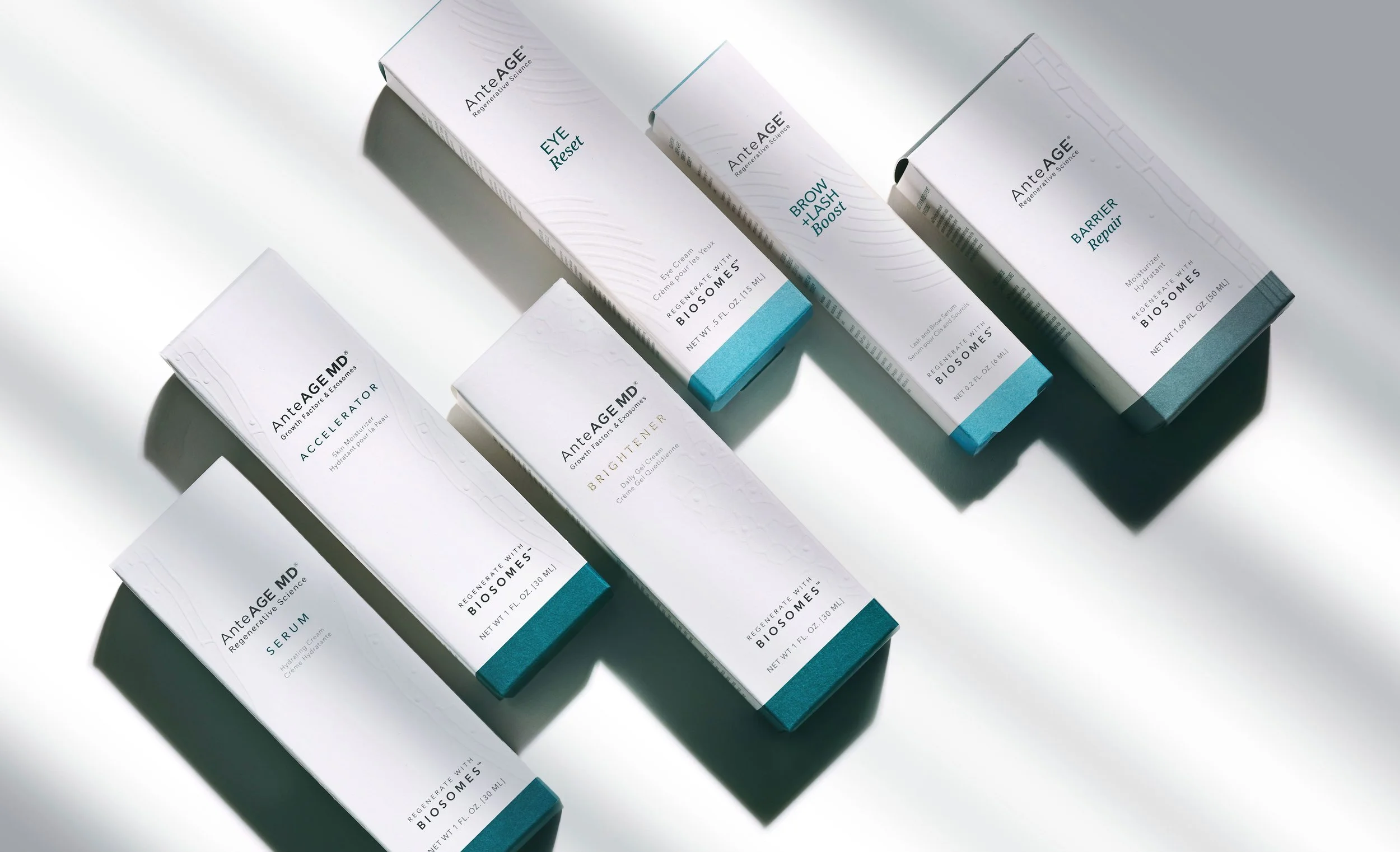
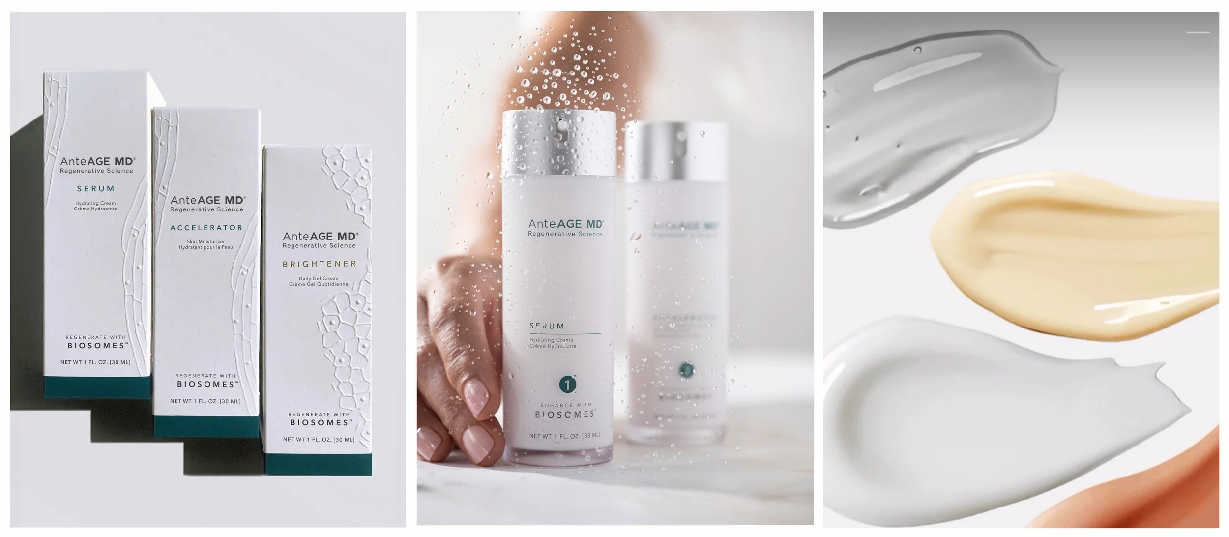
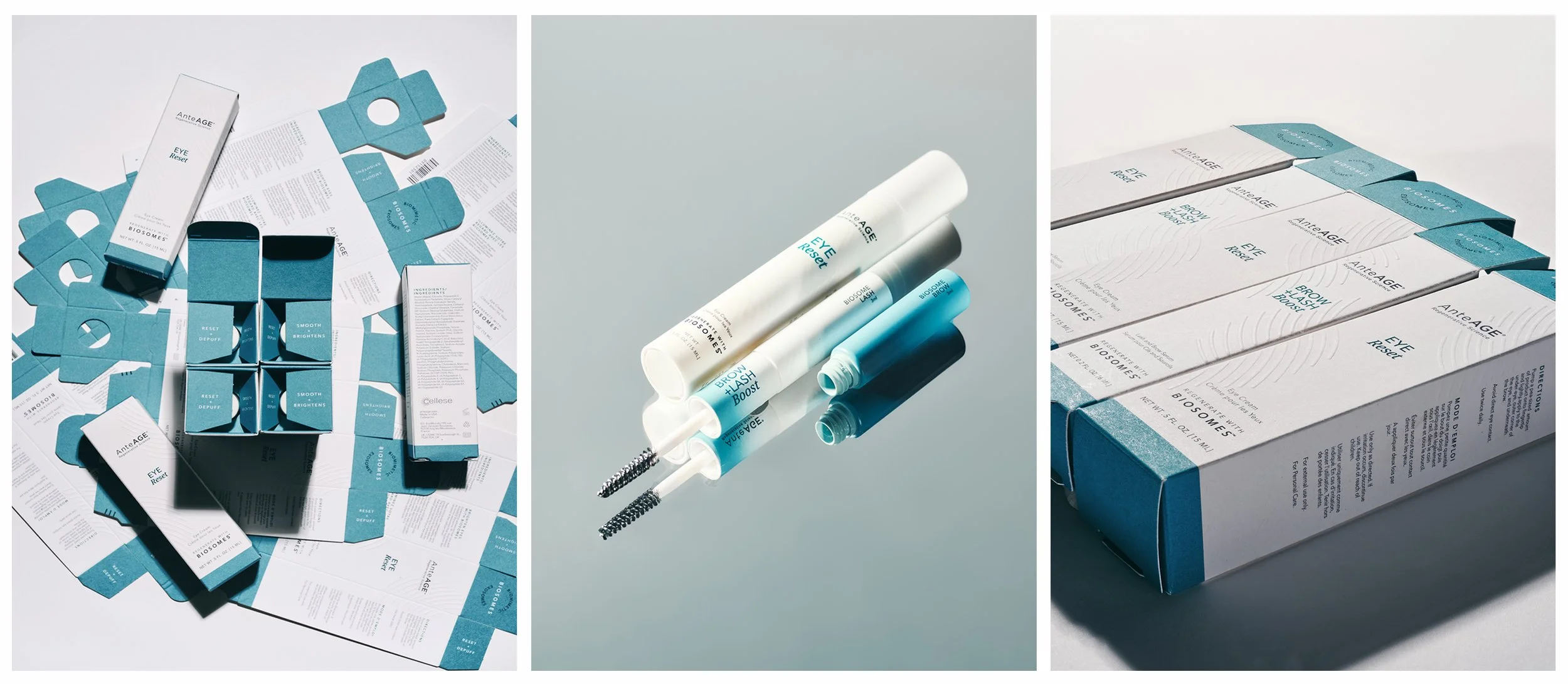
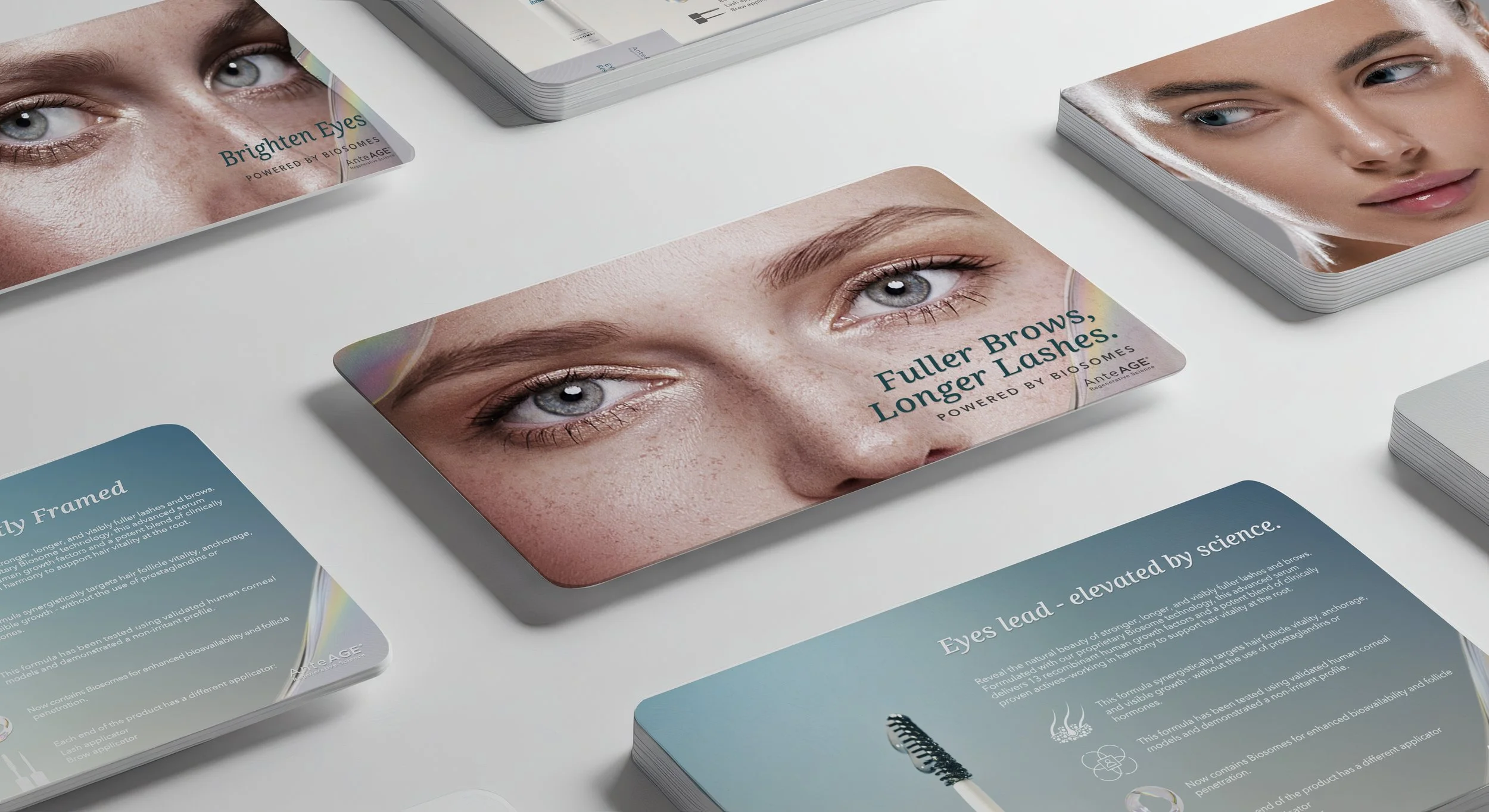

As part of the AnteAGE Homecare Collection rebrand, the packaging was redesigned to elevate the brand’s visual expression while maintaining its signature white aesthetic. The new system introduces a more sophisticated and sensorial design language that reflects both the function of each product and the regenerative science behind it.
Embossed abstract textures serve as a visual and tactile code throughout the collection. Inspired by the treatment areas each product addresses, as well as the microscopic structures of the skin, these patterns create a subtle connection between form and function. Rather than relying on literal illustrations, the textures translate biological structures and anatomical references into refined abstract compositions that communicate the science behind the formulations.
The raised embossing enhances the sensory experience, transforming each package into a tactile expression of the brand and creating a more engaging interaction with the consumer.
Minimal teal accents reinforce brand recognition, resulting in packaging that feels modern, refined, and distinctly reflective of advanced regenerative technology.